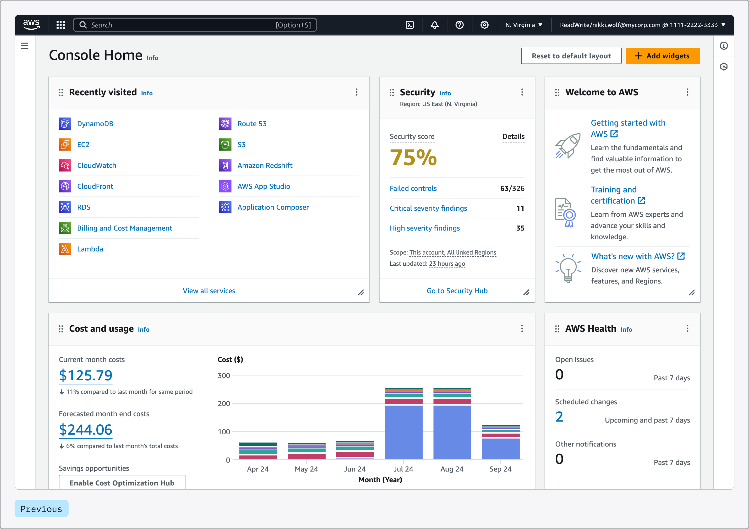
Today, we are announcing a visual update to the AWS Management Console in preview. We are rolling out this update by using the latest version of Cloudscape, the Amazon Web Services (AWS) design system used to build intuitive, inclusive, and meaningful AWS experiences at scale.
In this post, I describe how the visual update makes it easier for you to scan content, focus on the key information, and find what you are looking for more effectively while preserving the familiar and consistent experience of the AWS Management Console.
Improved readability
A revised typography scale and improved treatment of headings result in a stronger visual hierarchy, which helps you to better locate and understand your data. A refined use of color and weight across text elements help you differentiate key pieces of information faster. For example, you’ll see that labels in form fields are now more prominent, which eases scanning. The same applies to keys in key-value pairs and sections across components, such as service navigation, expandable elements, and tabs.
We improved the color palette, made it more vibrant, and simplified the color treatment of interactive elements. For example, secondary buttons, links, tokens, and interactive states for numerous interface elements are now blue, making it easier for you to interact with the content on the screen and contributing to improving task efficiency.
Improved focus in light and dark mode
Reduced visual complexity supports user focus. We replaced drop shadows with a new thinner stroke on main content wrappers, such as cards, panels, and containers, and unified the use of border styles across components. This reduces visual noise and optimizes the space inside the layout. Shadows are now reserved to add emphasis on specific interactive and transient elements, which helps simplify visual depth and improves the overall content hierarchy.
We also released updates to dark mode to address the need for clearer differentiation between elements on the page. These changes include an update to the color ramp and improved contrast between interactive states across components.
Modernized interface
We modernized the interface while retaining familiarity to continue to offer predictable and recognizable experiences across AWS. The user experience is now easier on the eyes, thanks to the use of rounder shapes, brighter colors, and improved layout treatment. These updates create a smoother, more natural appearance, making the interface more visually pleasing.
To deliver a more delightful experience and support visual storytelling, we also introduced a whole new family of illustrations and motion while still offering the highest accessibility standards.
Improved information density
We optimized information density by reducing unused space, leading to more content visible on the screen. Related data is now displayed closer together, reinforcing visual grouping. Space within content wrappers such as cards and containers has been minimized, so you can consume more information at once. The new layout is centered and wider, optimizing the experience to serve larger screen sizes than before. The visual update makes it easier to consume information, which creates a better and friendlier experience within the AWS Management Console.
Additionally, we introduced Toolbar, a new way to navigate and access contextual tools and features. This helps you perform your tasks while maximizing the amount of content available on screen.
Improved consistency
The interface is now more distinctive and consistent. Refreshed colors, iconography, and shapes help deliver a more dynamic and expressive experience while reinforcing a unified and cohesive journey across all AWS experiences.
Available now
You can start experiencing the visual update now in selected consoles across all AWS Regions by visiting the AWS Management Console. We’ll be extending the update across all services. Thanks to the new visual treatment, you can now benefit from an experience that’s more readable and intuitive and that contributes to improved overall task efficiency.


